
The new Dot Tel Domain display is a significant change for this top level extension. The new display will be released in March, 2010. I am somewhat positive about the new display design. However, it seems to have drawn its inspiration from Tax Department forms; especially those of New Zealand, a country South-East of Australia.
Telnic is the promoter of Dot Tel. Their timing with the new design is excellent. It was no doubt planned for the month before the domain's first year renewals which are due on 24th March, 2010. The display changes are dramatic, and welcomed. They are the shot in the arm that this internet top level domain extension needed. I mean, who got any pleasure out of showing anyone their Dot Tel with the current display?
Colour customisation will be offered through a series of templates. I do not know the details yet of those templates. The components of the design appear to be square, whereas the old design was curved. I liked the shape of the previous design. It was the drab colour scheme that was the problem. I am ambivalent on colour customisation because I do not know if it will detract from the Dot Tel brand. I favour just one template with a fantastic design to keep the brand strong and recognisable.
Strong and colourful borders are better. Although colours increase the data amount per page, data costs are falling. Perhaps in time, as data costs drop the display will evolve into something that people really love to see.
The Tel logo will be moved to the bottom of the page. This is a shame because it completed the text header for the current web site page. The current design also put the logo right in the user's face when they pulled up the page. It now has a semi-tube or lens-like design. I preferred the previous Tel logo for its simplicity and I think that the change was not required. It will also affect brand recognition as it will sit below the fold of the page on many computers and mobile phones. Perhaps, the logo position will be adjustable.
The VCard is now at the top right of the page. This an improvement because it makes this important feature more accessible, or noticeable than when it was at the bottom right of the page.
Custom icons have been allowed for popular web sites such as LinkedIn, and Facebook. This is an improvement because well known and colourful symbols can now be placed on a Dot Tel page making the page more exciting. The previous display lacked this excitement factor.
The placing of well-known icons on the page improves the perceived quality of that page because they are some of the best known symbols in the world. They give a web page status whether that status is deserved or not. This is a major improvement which adds value to all Dot Tel Domains. There are also new contact type icons.
One thing missing from the new display is the breadcrumb trail that is on the current display. Studies of usability indicate that the breadcrumb is an indispensable part of a web page. I hope this is an error because it is a significant mistake to remove it. It could be at the very top left of the page on the same line as the new management tools. I hope they do not leave it out!
There are two new features which are critical. One is absolutely necessary and that is a way to search the current Dot Tel or all Dot Tels. Top marks here! The other addition is the top-of-the-page management and login functions. If I am not mistaken, this means that the previously roundabout route to managing a domain is gone. Excellent stuff and in the correct position, as is the search box.
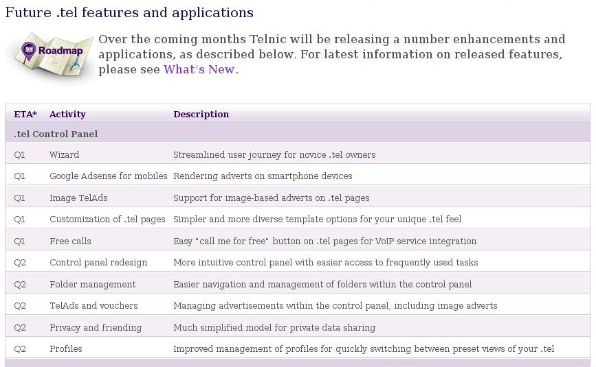
Telnic are also introducing Google AdSense on Dot Tels which will be greatly appreciated by owners. It will provide another income stream for Dot Tel owners, and add credibility to the domain extension. Hopefully, it will not involve any third party applications. This is another step in the right direction.
Telnic at long last have done some things right. There are still things to improve. After being available to the public for nearly a year, there are at last grounds for cautious optimism about the future of Dot Tel.
Bill Rutherfurd is an early Dot Tel adopter. He likes the fast access to contact data and information especially on mobile phones. It is also a very cheap web presence. To visit his Lake Taupo Region of New Zealand Dot Tel directory please use the link at http://www.squidoo.com/Taupodottel. He also has a dottel blog at http://www.dottel.blogspot.com.
Article Source: http://EzineArticles.com/?expert=Bill_Rutherfurd


Keine Kommentare:
Kommentar veröffentlichen